martes, 16 de enero de 2024

DC Cover Art The Bronze Age (1970-1986)

 THE BRONZE AGE 1970-1986

Characterized by a restless creativity and willingness to experiment, the Bronze Age began at DC with the crazy energy of Jack Kirby’s Fourth World saga and the social relevance of Denny O’Neil and Neal Adams’ Green Lantern. On the covers of that title, Batman, and numerous others, Adams worked with DC’s production department to achieve hitherto unseen effects with photostatted halftones and screens. Influenced by Adams and Nick Cardy’s realistic figure work and Kirby’s peerless imagination, artists like José Luis García-López, George Pérez, and Keith Giffen came to prominence, while a wave of British artists began to make their mark, from the considered stylings of Dave Gibbons to the studied elegance of Brian Bolland. Towards the end of the Bronze Age, Pérez and Marv Wolfman’s Crisis on Infinite Earths instituted a raft of sweeping changes, streamlining DC’s continuity and setting the stage for the Steel Age.


DETECTIVE COMICS #395 January 1970

Artist: Neal Adams

The dynamic creative partnership between writer Denny O’Neil and artist Neal Adams would redefine Batman (not to mention Green Lantern and Green Arrow) for the Bronze Age.

It began with this issue: Adams’ cover encapsulates the gothic tenor of the main story, “The Secret of the Waiting Graves”, which introduced an element of the supernatural to Batman’s mythos.

DETECTIVE COMICS #408 February 1971

Artist: Neal Adams

This startling cover, illustrating Len Wein, Marv Wolfman, and Neal Adams’ spooky tale “The House that Haunted Batman”, was something of an experiment for Adams. The artist was concerned that having to use a tier of panels to show Robin’s disintegration would mark the cover as a failure, but the impact of the bottom panel brings the composition together.


DETECTIVE COMICS #457 March 1976

Artist: Dick Giordano

One of the most important Batman stories of the Bronze Age, Denny O’Neil and Dick Giordano’s “There Is no Hope in Crime Alley!” revisits and revises the murder of Bruce Wayne’s parents, introducing Leslie Thompkins as a key figure who comforted the bereaved Bruce. Giordano’s clever cover conceit of framing the murder within Batman’s profile reinforces its formative influence.


DETECTIVE COMICS #472 September 1977 

Artists: Marshall Rogers and Terry Austin

Marshall Rogers was a relatively new and untested artist when he and writer Steve Englehart began an eight-issue run on Detective Comics in 1977, but their tenure is one of the most significant and influential in Batman’s history. Rogers’ second cover is his first outright classic, evoking the simplicity of early Bob Kane but with a modern stylistic twist.


DETECTIVE COMICS #477 June 1978

Artists: Marshall Rogers and Dick Giordano

Aside from a framing sequence by Len Wein and Marshall Rogers, this issue’s story is a reprint of Detective Comics #408, but Rogers’ cover is among his finest. In contrast to Neal Adams’ experimental panelled cover for the story’s first appearance (p.84), Rogers instead chooses to illustrate the dramatic moment when Robin shoots at Batman.


DETECTIVE COMICS #476 April 1978

Artists: Marshall Rogers and Terry Austin


DETECTIVE COMICS #500 March 1981

Artists: Jim Aparo, José Luis García- López, Dick Giordano, Carmine Infantino, Joe Kubert, Walt Simonson, Bob Smith, and Tom Yeates

Identified by editor (and eventual DC president) Paul Levitz as DC’s first “jam” cover, this multiple-artist anniversary wraparound stars the many characters who appeared in Detective Comics over its 500 issues. Beginning with Joe Kubert’s Hawkman and Hawkgirl, each artist in turn added their characters to the composition.


DETECTIVE COMICS #503 June 1981

Artist: Jim Starlin

Best known for space opera epics like Dreadstar, Jim Starlin drew just a handful of Batman and Detective Comics covers (though he later scripted Robin’s demise in the “A Death in the Family” storyline). This memorably macabre cover was used by Gerry Conway and Don Newton as the basis for their interior story, “The Six Days of the Scarecrow”.

“The Laughing Fish” is regarded not only as the apotheosis of Steve Englehart and Marshall Rogers’ Detective Comics run, but also one of the greatest-ever stories of The Joker. For the cover of this second part, Rogers focuses on The Joker’s unfortunate victims, revealed from the cape of an evilly grinning Batman – in reality another victim wearing the hero’s costume.


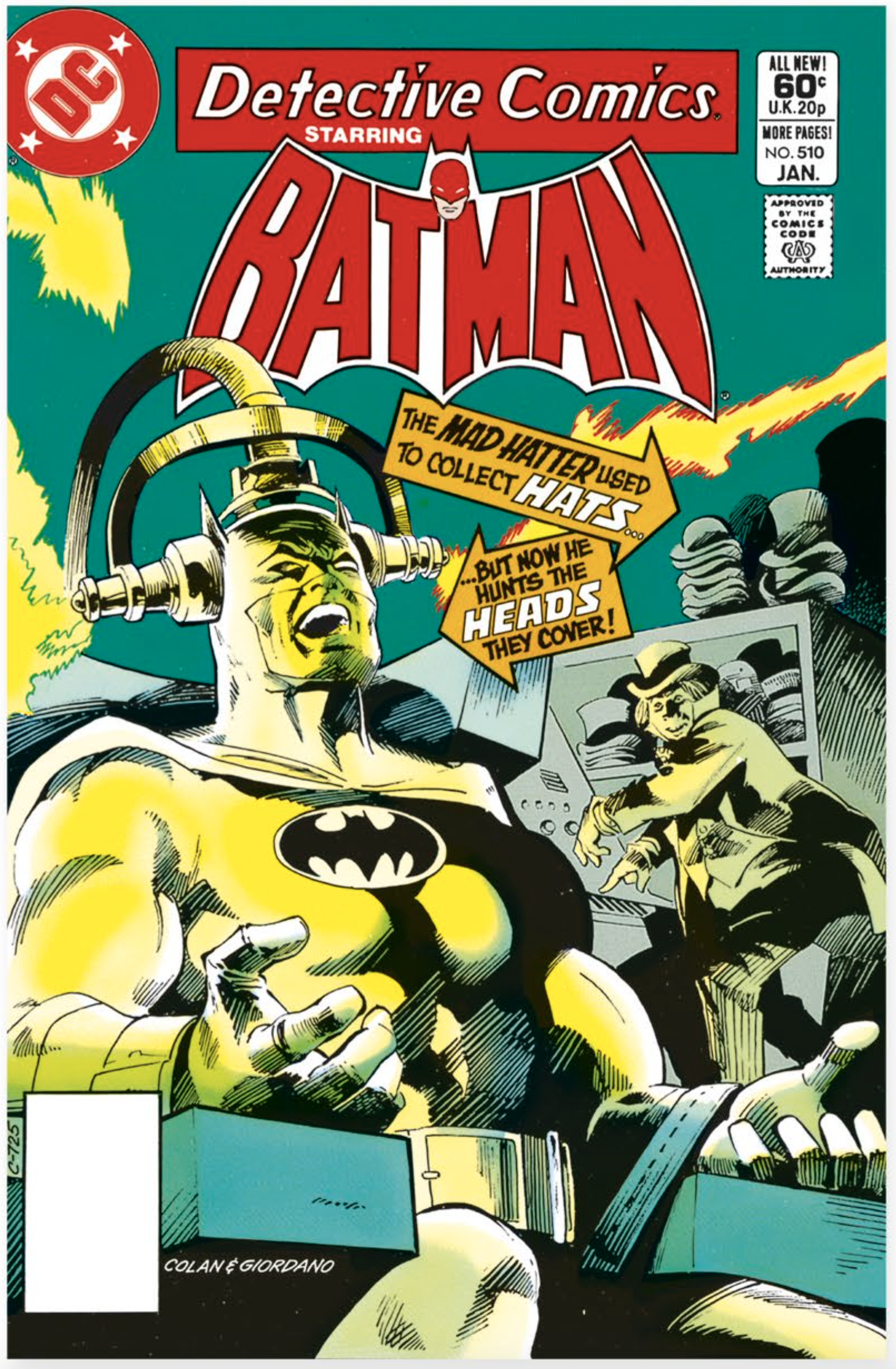
DETECTIVE COMICS #510 January 1982

Artists: Gene Colan and Dick Giordano

Famed for his work on Daredevil and Tomb of Dracula, Gene Colan became one of DC’s main Batman artists in 1981 (having previously drawn DC romance comics in the Silver Age). His first Detective Comics cover is a chiaroscuro masterpiece, displaying Colan’s characteristic ability to suggest form with light and shadow, while the arrow captions lead the eye round the composition.


lunes, 15 de enero de 2024

DC Cover Art. The Modern Age (2011-Present)

THE MODERN AGE 2011-Present


In 2011, DC initiated their most radical reinvention yet, restarting their entire line – something not even Crisis on Infinite Earths had done – in the shape of the New 52. Superman, Batman, Wonder Woman, and the rest of DC’s Super Heroes underwent seismic changes, overseen artistically by Jim Lee, and were revised again in 2016 in the Rebirth initiative, hewing closer to classic interpretations. Concurrently, variant covers exploded, allowing newer artists like Jock, Amanda Conner, Jenny Frison, and J. H. Williams III to showcase their talents. But though there was a greater diversity of styles and techniques than ever before, covers still fulfilled the same purpose in the modern, digital age as they had at the birth of the medium: to convince readers to buy that comic – to read, to collect, to treasure – whether as a download, or in the printed, stapled format that had started it all.


BATWOMAN #0 January 2011

Artist: J. H. Williams III

Originally introduced in the 52 series in 2006, the new Batwoman – alias heiress Kate Kane – was moderately redesigned by J. H. Williams III when she starred in Detective Comics in 2009. After she got her own series in 2011, Williams, now co-writer, created an extraordinary run of complex covers, combining brilliant design with exquisite draftsmanship.


BATWOMAN #1 November 2011 

Artist: J. H. Williams III

Though he also uses digital techniques, J. H. Williams III prefers working traditionally in the first instance, embracing the process’s inherent risks. This cover was created in black-and-white with ink, marker grey tones, and ink wash, then coloured digitally; the artist added green mist to enhance villain the Weeping Woman’s ghostly quality.


BATWOMAN #8 (variant cover) s December 2017 

Artist: Michael Cho

Shortly after Batwoman gained a new series as part of the Rebirth initiative, Michael Cho began a run as variant cover artist. His pared-back style, achieved with brushes, ink, markers, and gouache, reflects both his background in book cover design and the influence of Golden and Silver Age artists.


BATMAN INCORPORATED #1 January 2011

Artist: J. H. Williams III

Writer Grant Morrison’s high concept for the 2011 Batman Incorporated series was Batman establishing a global crime-fighting franchise, training heroes around the world. On the first issue’s cover, J. H. Williams III finds a novel way to encapsulate Morrison’s notion, placing Batman on a background of flags to denote the various nationalities of the Dark Knight’s new army.


BATMAN INCORPORATED #4 April 2011

Artist: J. H. Williams III

While J. H. Williams III had depicted Batman and Batwoman on covers before, this was the first time he portrayed them together. To illustrate the wary distance between the two characters – who had rarely interacted – the artist positions them at different heights. The Rian Hughes-designed logo is incorporated into the artwork in a typically innovative fashion.


ALL-STAR BATMAN #13 October 2017 

Artist: Rafael Albuquerque

Launched in 2016, All-Star Batman saw writer Scott Snyder collaborating with several different artists. The final arc was illustrated by Rafael Albuquerque, who had previously worked with Snyder on American Vampire. His penultimate cover shows a stunning, lightning-lit rooftop battle with a logo turned into pink neon signage.


SUPERGIRL #61 April 2011

Artist: Amy Reeder

Getting her start at DC in 2008 as artist on Madame Xanadu, in 2010 Amy Reeder began a year-long run of Supergirl covers. On this cover, Reeder’s background in manga can be seen in her figure work, composition, and arrangement of sound effects, the latter of which recalls Mike Sekowsky’s Justice League of America #46 cover.


Edgar P. Jacobs, el genio oculto del tebeo europeo

La reedición de su icónica serie "Blake y Mortimer" y un cómic biográfico rescatan la figura del creador belga

Álvaro Pons

Edgar P. Jacobs (1904-1987) quería ser un barítono famoso. Después de mucho tiempo actuando como figurante, logró debutar en la ópera, pero el bel canto no pagaba las facturas y tuvo que aprovechar otras de sus dotes para poder vivir: el dibujo. Desde el inicio de la II Guerra Mundial, el belga se dedicó a la ilustración, que le abriría las puertas de la revista infantil Bravo!, donde pronto fue apreciado su perfeccionismo, que le llevó a un encargo que cambió su vida: hacerse cargo de una de las series preferidas del público, el Flash Gordon de Alex Raymond. Con la llegada de ejemplares desde EE UU paralizada por la guerra, Jacobs le dio continuidad a las historias originales del personaje y logró clonar el preciosista estilo académico del dibujante americano. Un esfuerzo que le permitió que la revista le diera la oportunidad de proponer una serie propia, El rayo U.


E.P. Jacobs: El soñador del apocalipsis, de François Rivière y Philippe Wurm, editado por Norma


Un cómic biográfico, E.P. Jacobs: El soñador del apocalipsis, de François Rivière y Philippe Wurm, rescata el talento del autor, que también puede comprobarse gracias a la reedición de su serie más famosa, Blake y Mortimer (Norma Editorial).

En su primer trabajo personal para Bravo! se comenzaban a vislumbrar varias constantes de su carrera: la pasión por una tecnología representada con verosimilitud, el reflejo de la actualidad sociopolítica y el cuidado tratamiento del color. Sería esta última la que atraería la atención de Hergé, que le contrataría como ayudante para colorear Tintín en el Congo y El cetro de Ottokar. Su primer éxito vendría con la creación de la revista Le journal de Tintín, que le daría la oportunidad de volver sus inquietudes en una serie donde fuera un autor completo.

Aunque Jacobs quería hacer una historia situada en la Edad Media, la dirección de la revista le encargó una trama más actual, para la que el autor echaría mano a sus lecturas de juventud: desde el folletín tan del gusto francés a la ciencia ficción de H. G. Wells y Julio Verne, pasando por Conan Doyle. Con ese bagaje nació El secreto del Espadón, que con el subtítulo Neptunium y el rayo de plata introducía una trama de espionaje protagonizada por dos héroes carismáticos: el capitán Francis Blake y el brillante científico Phillip Mortimer. Un dúo con química basada en el contraste de personalidades.

Moviéndose entre la ciencia ficción y el espionaje, la serie aprovechaba escenarios exóticos como el Egipto de El misterio de la gran Pirámide para epatar a un joven público lector que las devoraba. La serie se convirtió en un referente absoluto de la línea clara, siempre en ese marco de aventuras que tendría en Las 3 fórmulas del profesor Sato, su última entrega, con una accidentada publicación que impidió a su autor verla finalizada, tal y como narra el reciente tebeo sobre su biografía.

El final de la saga llegaría tres años después de la muerte de Jacobs gracias al trabajo de Bob de Moor, que acabaría la obra a partir del guión del autor original. Sin embargo, Blake y Mortimer no estaban destinados a pasar al panteón de ilustres personajes perdidos de la historieta. Unos años después, el diario francés Liberation abría su edición del 21 de septiembre de 1996 con una amplia viñeta que anunciaba: "Blake & Mortimer han sido encontrados", dedicando un extenso reportaje a la reanudación de las famosas historias de la mano de dos figuras reverenciadas del cómic franco-belga, el guionista Jean Van Hamme y el dibujante Ted Benoit. Una iniciativa que era tan solo la cara visible de una inmensa operación empresarial: el sello Dargaud había pagado cantidades millonarias a Studio Jacobs y el anterior editor de los álbumes de los personajes. El exquisito trabajo de Van Hamme y Benoit tuvo una respuesta abrumadora con más de 600.000 ejemplares vendidos y el reconocimiento de la crítica.

La espectacular acogida animó a prolongar la serie con una larga trayectoria de entregas que ya supera a las firmadas por su creador y a la que se han añadido desde una parodia oficial, Les aventures de Philip et Francis, de Pierre Veys y Nicolas Barral, hasta versiones fuera de colección que exploran conexiones con otras series; o incluso un hipotético final en el que unos personajes ya ancianos recordaban sus aventuras epistolarmente en la inédita en España El último capítulo, de Convard y Juillard. Sin duda, Jacobs creó con Blake y Mortimer uno de los grandes iconos del cómic europeo, que proyecta aún hoy su fundamental influencia.


El Pais. Cultura. Lunes 15 de enero de 2024


DC Cover Art. The Silver Age (1956-1970)

 The Silver Age 1956-1970


SHOWCASE #4 October 1956

Artists: Carmine Infantino and Joe Kubert

The Silver Age began with Showcase, a key title that was the launchpad for numerous new characters and reworkings of Golden Age concepts. First out of the blocks was The Flash, reimagined as police scientist Barry Allen by writers Robert Kanigher and John Broome and cover artist Carmine Infantino. Here, Infantino uses a film strip device to convey the character’s speed.


SHOWCASE #22 October 1959 

Artist: Gil Kane

Having enjoyed great success with reimagining The Flash, editor Julius Schwartz assigned writer John Broome and artist Gil Kane to rework Green Lantern. The result was test pilot Hal Jordan, who is given a power battery and ring by dying alien Abin Sur and recruited into an organization of “space-patrolmen in the super-galactic system” (later named the Green Lantern Corps).


SHOWCASE #34 October 1961

Artists: Gil Kane and Murphy Anderson

The third Golden Age hero to be completely reimagined in Showcase, in the hands of editor Julius Schwartz, writer Gardner Fox, and artist Gil Kane, The Atom became scientist Ray Palmer, who uses a dwarf star fragment to shrink himself. Much as he had with Green Lantern, Gil Kane had a long-lasting association with the character, which continued into the 1980s.


SHOWCASE #73 March 1968 

Artist: Steve Ditko

In 1968, Steve Ditko arrived at DC. One of the greatest artists to ever work in comics, he immediately unleashed one of the most unique heroes in the company’s history. Debuting in this issue of Showcase, The Creeper – alias talk-show host Jack Ryder – was a bizarrely garbed crime fighter whose eerie laugh Ditko incorporates into the cover design.


SHOWCASE #75 June 1968

Artist: Steve Ditko

Two issues on from The Creeper’s arrival (and trailed in an advertisement in Showcase #73), Ditko debuted another high concept for DC. The duality of teenage brothers Hank and Don Hall – the aggressive Hawk and pacific Dove – is reflected in Ditko’s mirrored cover composition. Ditko’s initial stint at DC was brief; he departed shortly after this, returning in 1975.


DETECTIVE COMICS #241 March 1957

Artist: Sheldon Moldoff

One of the most memorable concepts to grace a cover in the Silver Age, the premise of “The Rainbow Batman” is less wacky than it might at first appear: Batman dons a series of colourful costumes in order to draw criminals’ attention away from an injured Robin. Three years later, in Detective Comics #275, Sheldon Moldoff introduced another crazy costume: the Zebra Batman!


DETECTIVE COMICS #359 January 1967

Artists: Carmine Infantino and Murphy Anderson

Commissioner Gordon’s daughter, Barbara, wasn’t the first Batgirl – she was preceded by Betty Kane in 1961 – but when she was introduced in this issue (at the request of the Batman TV show producers), she proved a resounding hit. Working with editor Julius Schwartz, Infantino designed a costume based on Batman’s, but with its own flourishes and striking, very modern, black-and-yellow colour scheme.


sábado, 13 de enero de 2024

El impresionismo pictórico tiene base científica por un tubo

El tubo de estaño con tapón de rosca revolucionó el mundo de la pintura al sacar a los pintores de sus estudios para pintar al aire libre

Impresionismo pictorico


Tubo de estaño con tapón de rosca para guardar la pintura al óleo. Este invento revolucionó el mundo del arte y trajo el impresionismo./DIPINGI


MONTERO GLEZ

11 ENE 2024 


Si hay un estilo pictórico influenciado por el método científico, ese estilo es el impresionismo. Pero vayamos por partes, o mejor, por instantes. Porque en un primer instante, el término pictórico “impresionismo” nació para resignificarse, es decir, para llevar la contraria a un artículo burlón escrito por el crítico Louis Leroy en abril de 1874 en el periódico satírico Le Charivari, y titulado: La exhibición de los impresionistas. Se trataba de una pieza burlona en la que se ridiculizaba la exposición que tuvo lugar en el salón de artistas independientes de París, donde, entre otras tantas obras, destacaba el cuadro de Claude Monet titulado Impresión, sol naciente.

Dando la vuelta al significado del término acuñado por Leroy, el impresionismo pasó a definir un estilo pictórico donde se experimentaba con la vibración de la luz sobre los cuerpos a base de pinceladas discontinuas; una técnica que, tiempo después, ya en el siglo XX, se denominaría “pincelada gestáltica”, aludiendo a la psicología de la Gestalt, corriente de la psicología moderna nacida para demostrar científicamente que “el todo es más que la suma de sus partes”, lo que aplicado al arte pictórico impresionista viene a demostrar que las manchas de colores, dispersas en apariencia, son percibidas por nuestro cerebro de una manera unitaria. De esta forma, la pintura de los impresionistas, con sus trazos cortos y de aspecto agotado, abrirían la puerta al puntillismo, una técnica pictórica trabajada a base de puntos que, contemplados a cierta distancia, definen cuerpos y paisajes.

Con todo, el impresionismo no hubiera existido sin el instante preciso que llevó al norteamericano John Goffe Rand a inventar el tubo de estaño con tapón de rosca, lo que revolucionó el mundo de la pintura y afianzó la corriente impresionista. John Goffe Rand lo patentó en 1841 y, hasta entonces, si un pintor salía con sus bártulos a pintar al aire libre, cargaba sus pigmentos en vejigas de cerdo. Por eso, el hecho de conservar la pintura en tubos que mantuvieran vivos los colores hasta que se terminasen fue un estímulo para pintores como Monet, el artista que dio nombre a un estilo sin proponérselo; un buen día salió de su estudio dispuesto a captar la luz que se reflejaba en las aguas del puerto de Le Havre mientras amanecía sobre los barcos. Lo demás es cosa del azar y de la mala baba de un pintor metido a crítico pictórico.


Ejemplar del tubo de pintura que permitió que los artistas pintaran en el exterior sin que se secasen los pigmentos./CHRYSLER MUSEUM OF ART

Pero si hay una figura científica que contribuyó al estudio de los colores y de su percepción, esa figura fue la del físico Hermann von Helmholtz (1821-1894) quien publicó un trabajo esencial para los pintores impresionistas titulado: Manual de óptica fisiológica, donde afirmaba que el color es una percepción. De esta manera, un libro científico se convertiría en un libro de referencia artística durante la segunda mitad del siglo XIX.

Hermann von Helmholtz, con su descubrimiento óptico por el cual en nuestra retina solo combinamos tres colores —rojo, verde y azul—, demostró que los demás colores se originan en el cerebro. Esto supuso una nueva forma de aplicar los pigmentos; sobre todo a las sombras que dejaron de ser negras. Por estas cosas, el impresionismo pictórico se vio estrechamente ligado al campo científico. Fue un instante de Europa en el que la luz de la ciencia vino a alumbrar la pintura.


El Pais


The Art of Star Wars VISIONS


jueves, 11 de enero de 2024

DC Cover Art Golden Age (1938-1956)


THE GOLDEN AGE 1938-1956
                                 

DETECTIVE COMICS #27  May 1939 
Artist: Bob Kane
Along with Action Comics #1, Detective Comics #27 ranks as one of the most important comics in DC’s history: the debut of Batman (or “the Bat-Man”, as he is identified inside the issue). Conceived and drawn by Bob Kane, the Batman’s pointed ears and cape were suggested by writer Bill Finger, who established many of the character’s early traits and supporting cast.

DETECTIVE COMICS #1 March 1937
Artist: Vincent Sullivan
Detective Comics was the final DC title to be published under the aegis of entrepreneur Major Malcolm Wheeler- Nicholson (following New Fun Comics and New Comics). Issue #1 features among its offerings P.I. Slam Bradley, conceived by Wheeler-Nicholson and crafted by Jerry Siegel and Joe Shuster. The racially insensitive cover may be problematic to modern eyes, but is notable as the first to be devoted to a single subject.

 
DETECTIVE COMICS #31 September 1939 
Artist: Bob Kane
Batman’s third appearance on the cover of Detective Comics is also among the most iconic covers ever created. Now garbed in a more familiar cape as opposed to stiff wings, and towering over villain the Monk, Batman’s gothic appearance here has been referenced by among others Matt Wagner, Klaus Janson, and Neal Adams (twice).
This issue also sees the debuts of the Bat-gyro (Batplane) and weapons known as Batarangs.


     DETECTIVE COMICS #69 November 1942
Artist: Jerry Robinson
Co-creator of The Joker with Bob Kane, Jerry Robinson helped establish the classic look of the character, exemplified here by the villain’s second Detective Comics cover appearance (later referenced
by Walt Simonson and Bruce Timm). As well as the joker in a deck of cards, Kane and Robinson supposedly drew inspiration for the character from actor Conrad Veidt in the 1928 film The Man Who Laughs.


DETECTIVE COMICS #38 April 1940
Artists: Bob Kane and Jerry Robinson
Robin (alias acrobat Dick Grayson) made his debut in this issue. Bob Kane stated that he was based on Robin Hood, something that can be seen in the lettering of the character’s name and his costume design. Interestingly, co-creator Bill Finger believed artist Jerry Robinson named the character by lopping off the end of his own surname.


DETECTIVE COMICS #168 February 1951
Artists: Lew Sayre Schwartz and George Roussos
More than a decade on from his first appearance, The Joker’s origin is revealed in this issue, detailing his former guise as the Red Hood and his disfigurement in a chemical vat. Along with this sole Detective Comics cover, artist Lew Sayre Schwartz produced only a handful of Batman covers, but he estimated that he drew roughly 240 interior pages a year for Bob Kane.


     ACTION COMICS #1 June 1938
Artist: Joe Shuster
It could all have been so different. When publisher Jack Liebowitz was looking for an exciting cover for the first issue of his new title, deadline pressure prompted him to pick an image from a previously rejected, since-reworked strip about a superpowered alien. It was, said Liebowitz later, “pure accident”. Thus, Action Comics, Superman,
and the Super Hero were born.


ACTION COMICS #7 December 1938 
Artist: Joe Shuster
Jack Liebowitz’s co-publisher at DC, Harry Donenfeld, did not realize they had struck gold with the vivid, super-strong hero created by Joe Shuster and writer Jerry Siegel; while Superman would appear inside Action Comics, for a time he did not feature on the covers. However, when DC realized the title’s phenomenal sales were due to the Man of Steel, he returned to the cover with Action Comics #7.